Six different homepages
You said the last set looked alike, and it did: one grid, one page shape, six skins. This set differs in structure. Each one shows the two ways, the season, the six trips, your letter and the messages in its own way. Same words on all six, your lettering as the wordmark, no colours, no "Journeys".
Open each page on a laptop and on your phone. A bar at the bottom switches between all six and the study. Nothing on the live site has changed.
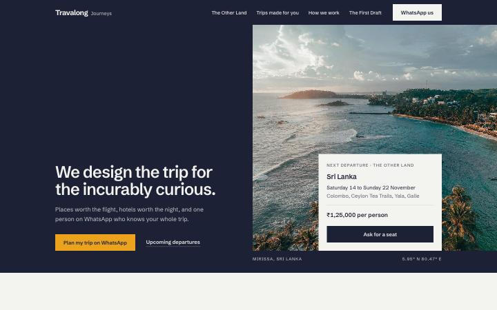
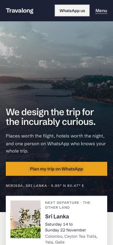
Atlas
Indigo and chalk, one bold grotesk, marigold on one button. Travel facts as design: flight time from Mumbai and the month squares. The two ways as two colours, the season as posters on indigo. The one you singled out; now with your wordmark.
Open B

The Night
A fashion campaign in the dark. Every section is a full screen photograph with the words on it; the two ways are two full height photos side by side; the season a filmstrip; the six trips a mosaic. Ink, white, one ice blue button. The most cinematic.
Open J

The Feed
The page is a grid of squares, like the feed your clients live in. Every photo, every line of text and every price is a tile; the two ways are two tiles side by side; the season nine tiles with their captions in a white band. One rounded sans that sits with the wordmark. The most Instagram.
Open K

The Ledger
Loewe and Lemaire restraint: a fixed left pane holds the wordmark, the menu and the words of whatever section you are on; the right pane scrolls the photographs. Garamond, white, one forest green. The quietest, and the most unusual to use.
Open L

The Blocks
Colour with confidence: every section a solid block of cobalt, forest, plum or sky, with the photographs framed in white like prints on a painted wall. A wide grotesk. The boldest.
Open M

The Issue
The homepage as a magazine: a cover with the wordmark as masthead, a contents page, then spreads with folios: the two ways as facing pages, the season as a calendar, the six trips as a portfolio, your letter as the editor's letter. The most editorial.
Open NWhat is the same on all six
- One master copy, written for someone who has never heard of Travalong: the curious headline and the priced Sri Lanka departure in the hero; a true split between the two ways to travel (The Other Land on the dark side, Trips made for you on the light side, both on one screen even on a phone); the season as nine portrait posters that scroll sideways; six real trips we drew this year, with photos; your full letter; the five quotes as WhatsApp messages; The First Draft; the closing band. Gone: Why we chose the hotel, How we work, the sample routes, the Recently designed list, every coordinate.
- No shared grid this time. Each direction has its own layout, checked for its own consistency. One type scale cap: headlines never above 52px on laptop or 34 on phones, body 16 to 17.
- One motion budget: a hero entrance, headings and photos settling once, hovers, and exactly one signature moment per page. Phones get the light version.
- Text on photos tested against four stress photos (white sand, bright sky, white temple, pale pool) so the hero still reads when you change the picture.
Verification record
Every page was checked by its builder and then again by me, independently, at 1440 and 390 wide.
| Check | A | B | F | G | H | I |
|---|---|---|---|---|---|---|
| Horizontal overflow, off screen, overlapping or clipped text | 0 | 0 | 0 | 0 | 0 | 0 |
| Text over photos failing contrast on four stress photos | 0 of 22 | 0 of 16 | 0 of 23 | 0 of 22 | 0 of 17 | 0 of 24 |
| Your letter, word for word (10 blocks) | 10 | 10 | 10 | 10 | 10 | 10 |
| Hyphens or dashes in visible text | 0 | 0 | 0 | 0 | 0 | 0 |
| The word luxury, "on a call", seat count in hero | 0 | 0 | 0 | 0 | 0 | 0 |
| Left edges on grid lines only, equal section spacing, three photo shapes | yes | yes | yes | yes | yes | yes |
Round ten (29 Oct): five new directions built from scratch on different structures; B kept; the wordmark cut from your logo artwork. Every photo slot audited again. Found and fixed earlier: a head ordering bug that switched off every animation on real phones, and a smooth scroll rule that hid elements from the checker.